Logo usage
This section covers the usage of the master logo, its construction, and instructions on how to use it properly. If you need something further defined please reach out to your contact.
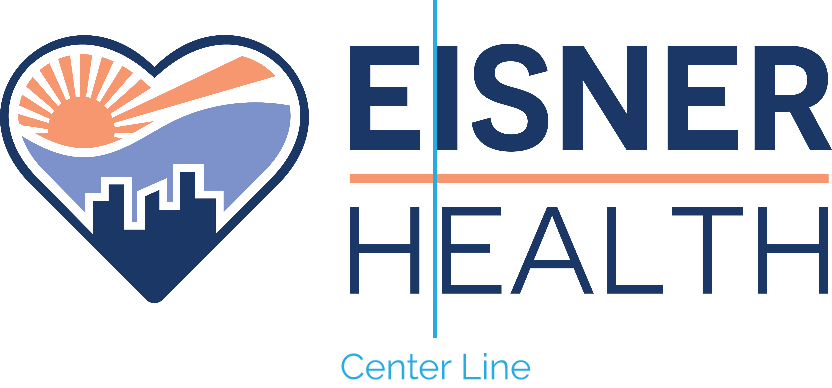
Anatomy
The logo includes the Eisner Health icon mark and a logotype. Both are important and should always appear together. The relationship between these elements has been established, and these proportions are fixed as illustrated. They must never be altered or modified in any way.
Centering
The logo should be centered optically. If centered mathematically, the logo will appear too far to the right due to the rounded edge of the heart. Instead, center the logo using the left side of the “I.”
Size
Whenever possible, the logo should be used at a size between 1.75” and 2.25” on printed materials. The logo is measured from the left edge of the icon to the right edge of the “t.”
Clear space
The importance of whitespace around brand elements and throughout all layouts cannot be overstated. It adds confidence and clarity to the visual messaging. The more, the better. These visuals are used to define minimums.
The minimum allowance for the master logo is equal to 2x the “E” in the logotype. This holds true regardless of scale.
For the mark, the minimum clear space allowance should be equal to half of the mark itself. Repeat the scale of the mark around it, regardless of the scale per circumstance.

One-color solid logos
The one-color solid black or white (sometimes called reversed) logos are intended for use when reproduction methods prohibit the use of the full-color logo. However, if the logo appears in a busy environment, such as over an image, a one-color logo may be ideal.


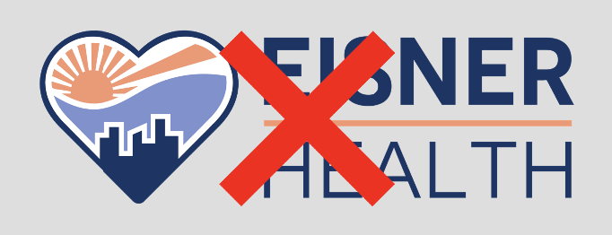
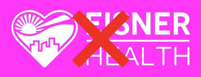
Backgrounds
The Eisner Health logo should only be used on a white background in full color or reversed out of dark blue or light blue logo colored backgrounds. Any other placement of logo over images or other colors are not to be used.


Proportions / Best practices
The Eisner Health logo should never be stretched, tilted or tampered with in any way. We do not add keylines, shadows or multi-colors to the logo.


Co-branding
If there is co-branding between Eisner Health and any other partner, the logos should be worked with a keyline separating the two.
LGBTQIA+
Whenever versioning any collateral that talks about being LGBTQIA+ friendly, we need to use this icon in the footer.


E.g.